
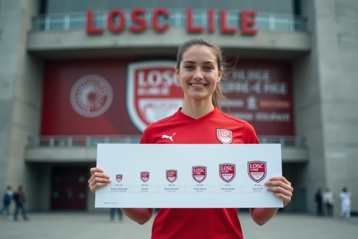
The logo of a football club condenses in just a few square centimeters an urban history, sports mergers, and successive graphic choices. The one for LOSC, born from the merger of two northern clubs in 1944, has gone through nine distinct versions before stabilizing in its current form. Understanding this succession of crests is to read between the lines the transformations of Lille and its relationship with visual identity.
The 1944 merger and the birth of a tricolor palette
LOSC (Lille Olympique Sporting Club) results from the merger on September 23, 1944, of two entities: Olympique Lillois, whose colors were red and white, and Sporting Club Fivois, represented by blue and white. This union produced a red, white, and blue palette that has never been abandoned since.
This chromatic choice is not trivial. It anchors the club in a dual heritage while evoking national colors, which facilitated supporter identification from the very first decades. Each subsequent version of the crest has respected this triptych, even when proportions or solid colors have changed.
To trace the evolution of Lille’s logo in detail, it is essential to keep in mind that these three colors constitute the non-negotiable foundation around which everything else has varied.
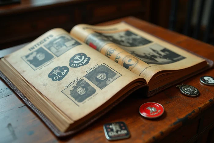
The dog and the fleur-de-lis: two heraldic symbols on the Lille crest
Two figures appear on the majority of versions of the crest: the dog and the fleur-de-lis. Their presence is not a result of a recent marketing choice, but rather an anchoring in the heraldry of the city of Lille itself.
Why a dog on the LOSC logo
The nickname “les Dogues” has a journalistic origin. The sports press associated the club with this animal, a symbol of tenacity and northern character. The dog was then graphically integrated into the crest, evolving from a stylized silhouette to a more detailed representation over the years.
On the current logo, adopted in 2018 under the presidency of Gérard Lopez, the dog appears in profile with a clean design. The simplification of the features enhances readability on digital media and textile merchandising.
The fleur-de-lis, emblem of the capital of Flanders
The fleur-de-lis adorns the walls of the Lille town hall and has been featured on the municipal coat of arms for centuries. Its integration into the LOSC crest ties the club to its territory. In recent visual materials, the fleur-de-lis gains visibility: it is no longer just a decorative detail but a structuring element of the graphic identity, also present on jerseys and official communications.
LOSC Logo 2018: the version that stabilized the visual identity
The ninth crest in the club’s history, unveiled in June 2018, marks a turning point. Validated by a consultation with supporters, it breaks away from the more classic forms of previous decades. Several technical choices deserve to be detailed.
- The overall shape adopts a rounded contour at the top and a point at the bottom, typical of modern European crests that must work equally well as a favicon and in large format printing.
- The lettering “LOSC” is integrated into a top banner, readable even at very small sizes, which meets the constraints of social media and mobile applications.
- The dog and the fleur-de-lis coexist in a confined space, with bold color blocks (dominant red, blue as an accent) that facilitate adaptation on light or dark backgrounds.
With this crest, Lille finished three out of four seasons at the top of the Ligue 1 standings, then won the title in 2021. The 2018 logo has become the one of the championship victory, which has reinforced its acceptance by the supporter base and curtailed any desire to modify it in the short term.
Scapular and jersey 2026-2027: the logo serving an expanded visual grammar
The visual identity of a club is not limited to its crest. It also encompasses recurring patterns on jerseys, typographies, and associated graphic codes. The home jersey for 2026-2027, designed by New Balance, illustrates this logic.
This jersey brings to the forefront the blue and white scapular, a diagonal band that crosses the chest. This visual signature directly references the Eden Hazard era and the 2011 French championship title. The choice to reactivate this motif shows that LOSC is not content with a static logo: it draws from its graphic archives to nourish a coherent visual system.
The fleur-de-lis also appears on the collar and finishes of the jersey, confirming its rising prominence in the club’s identity. The 2018 crest, stable for several seasons, serves here as an anchor point around which reactivated heritage elements revolve.
What distinguishes a club crest from a simple commercial logo
A corporate logo can change radically every five years without emotional consequence. A football club crest, however, engages a community. LOSC has learned this: every modification has sparked debates, sometimes heated.
The consultation with supporters in 2018 represented a methodological break. Validating a crest through a vote, even informal, gives the result a legitimacy that redesigns decided in a small committee do not have. It is also a design lesson: a club logo must be adopted, not simply unveiled.
The nine successive versions of the Lille crest show a trajectory common to many European clubs: elaborate coats of arms in the early decades, a transition through simplified geometric forms in the 1980s-2000s, and then a return to historical symbols treated with contemporary design codes. LOSC is currently in this last phase, with a crest that reconciles heraldic heritage and digital constraints.